Green
Green is the color of nature and represents balance and harmony. It is a very healing, soothing color which can be used to create a relaxing environment in any part of the home. If you suffer from auto-immune problems, asthma or bronchitis, green can provide some relief. It also helps to treat hyperactivity in children, and restores a calm environment. However, some shades of green can cause nausea, and may not be the best choice for dining areas. One way to use the color green in interior design is to combine different hues of it or combine it with other colors.
Sage, grey, pink and magenta go well together (think English country cottage garden). You could combine greens with neutrals and blues for a ‘coastal’ look. Alternatively, you could try mixing a tiny bit of he complementary color, red, into your green paint. That mutes it slightly and adds complexity and depth. Alternatively, you could tint it with white or light grey, or discolor it with some yellow or blue – these are all ways to utilize the psychological effects of the color green, while avoiding the decorating pitfalls.
Lighting influences any color in interior design – colors change their “personality” under different lights. So it’s really important that you test any green paint you want to use thoroughly in every possible daylight and artificial lighting situation.
Purple

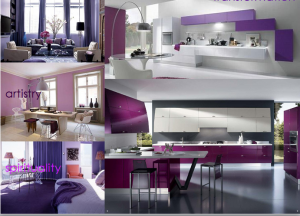
Purple is the color of true greatness, and is associated with inspired leadership. Purple is a positive inspirational color and is a good choice for creative people, particularly those that require solitude for inspiration, such as musical composers, poets, painters and sculptors.
Although it requires careful handling in interiors, purple is a striking color. It is the perfect color for meditation areas or relaxation rooms as it connects the mind, body and spirit. The psychological effects of the color purple will depend very much on how ‘warm’ or ‘cool’ the hue is:
- Bluish purples can be serene and calming and have a ‘mysterious’ depth
- Reddish purples demand more attention can can dominate a room (and are always in danger of looking garnish or cheap.
Yellow

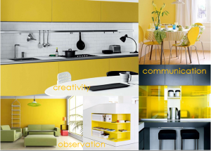
Yellow is generally seen as a light, optimistic color, and has a unique ability to raise the spirits and inject vitality into any area, as it is the color of sunshine and happiness and there are very few people who do not like the effect it creates.
Although yellow is strongly connected with creative energy, overuse of yellow can suggest a disturbed mind (so don’t get too carried away!). Van Gogh was famous for his love of yellow, but then again, he cut off his own ear.
Yellow creates a warm, welcoming first impression so it is a good choice in entrance halls. It is also a favorite for kitchens as it sets the mood for the rest of the day and helps creativity and conversation. It is a good choice for children’s bedrooms and helps to stimulate their creativity.
A pale, atmospheric tint of yellow on walls or on the ceiling can add ‘sunshine’ to a room, while saturated, intense yellows might make you feel cranky after a while. Because opinions about this color are so divided, I suggest you don’t worry too much about how the color yellow affects other – unless you share a home with them of course!
Your personal response to all things yellow will help you get the most out of this color. You may not necessarily want it on a wall in your home, but there are other ways of utilizing the psychological effects the color yellow. E.g, yellow makes for great “high-lights”. You could use smaller doses of it in accessories, flowers or pictures to brighten up darker areas and make them smile at you.


