


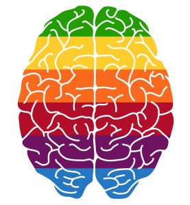
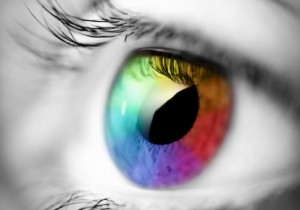
Anyone that has an interest in colour and design is naturally fascinated by the area of colour psychology.
However, for the most part, claims about how colour can affect the quality of life can bring out the sceptic in us,
If you are one of these people think about these simple questions;
> Would you paint a 3 year olds bedroom Black???
> Would you decorate your office board room “Barbie” pink???
> A room you want to relax at the end of the day – Could you relax in a room that was decorated entirely in Primary red, with red curtains and furniture.
These are extreme examples but they illustrate the point that colours are important to us,
And if you approach colour psychology with an open mind you will be amazed at the effect colour has to the point where it can seem almost magical.
Red
Red is the most powerful colour of the colour wheel. Red is the colour of fire and passion, and it represents our desires and cravings in all areas. Red can be seen as a stressful colour and has been shown to increase heart rate and blood pressure, so use it with caution.
Red has been shown to stimulate the appetite and conversation, Therefore, interior design professionals sometimes suggest using it for dining room walls (if you’re on a diet, maybe you could try blue instead?).
Red is the hottest colour of the spectrum and can make anywhere seem warm and cosy, so is ideal for people who suffer from the cold. Red is not a good choice where calmness and clear thinking are required, it’s energetic frequency is not conductive to areas where rest is needed, so it’s not a good choice for bedrooms or relaxation areas.
As with other colours, the psychological effects of the colour red depend very much on its intensity. So while vibrant, saturated hues of red have been shown to raise people’s heart rate and blood pressure, you might feel quite comfortable with muted, warm, earthy shades of red around you, for example:
• red ochre,
• venetian red,
• brick red,
That’s the type of red colour where you get all the warmth, comfort and energy, but with none of the exaggerated pulse.
Blue
The positive characteristics of blue are that has exceptional healing powers, and its calm restful nature can act as a potent sedative, making it a good colour for anyone with sleeping difficulties.
Blue is an ideal colour for bedrooms or restrooms of any kind, also in any area where you want to calm people under stress.
Blue’s ability to encourage clear thought makes it well suited to kids study areas in the home.
On the negative side, blue is like the sea, and can be calm and peaceful one minute, yet rocky and turbulent the next making blue prone to moodiness and not a very sociable colour.
It should be avoided by any that suffers from depression or sadness and avoided by anyone that is troubled by the cold.
It is not a good colour for playrooms or an area that you want to create a motivating atmosphere.
The following snippet of advice is something I’ve never tried myself – please take it with a seriously large pinch of salt. The psychological effects of the colour blue can help you restrain your appetite and lose weight.
So you might consider painting your kitchen and/or dining room blue (and eating from blue plates)
Green
Green is the colour of nature and represents balance and harmony.
Green is a very healing, soothing colour which can be used to create a relaxing area in any part of the home.
If you suffer from auto-immune problems, asthma or bronchitis, green can aid relief.
Green helps to treat hyperactivity in children, and restores a calm environment
Some shades of green can cause nausea, so it’s not the best choice for dining areas.
One way to use the colour green in interior design is to combine different hues of it, or combine the colour green with other colours.
Sage, grey, pink and magenta go well together (think English country cottage garden). Or, you could combine greens with neutrals and blues for a ‘coastal’ look.
You could also try mixing a tiny bit of the complementary colour, red, into your green paint. That mutes it slightly and adds complexity and depth.
Alternatively, you could tint it with white or light grey, or discolour it with some yellow or blue – these are all ways to utilize the psychological effects of the colour green while avoiding the decorating pitfalls.
Lighting influences any colour in interior design – colours change their ‘personality’ under different lights. So it’s really important that you test any green paint you want to use thoroughly in every possible daylight situation and under artificial lighting.
Purple
Purple is the colour of true greatness, and is associated with inspired leadership.
Purple is a positive inspirational colour and is a good choice for creative people particularly those that require solitude for inspiration, such as musical composers, poets, painters and sculptures.
Although it requires careful handling in interiors, purple is a striking colour.
As it connects the mind, body and spirit purple is a good colour for meditation areas or relaxation rooms
The psychological effects of the colour purple will depend very much on how ‘warm’ or ‘cool’ the hue is:
• Bluish purples can be serene and calming and have a ‘mysterious’ depth.
• Reddish purples demand more attention and can dominate a room (and are always in danger of looking garish or cheap).
Yellow
Yellow is generally seen as a light, optimistic colour, and has a unique ability to raise the spirits and inject vitality into any area, as it is the colour of sunshine and happiness, and there are very few people who do not like this colour and the effect it creates.
Although yellow is strongly connected with creative energy, overuse of yellow can suggest a disturbed mind. Van Gough was famous for his love of yellow, but then again, he did cut off his own ear.
Yellow creates a warm, welcoming first impression so is a good choice in entrance halls.
Yellow is a favourite for kitchens, as it set the mood for the rest of the day and helps creativity and conversation
It’s a good choice for children’s bedrooms to stimulate their creativity.
A pale, atmospheric tint of yellow on walls or ceiling can add ‘sunshine’ to a room, while saturated, intense yellows might make you feel cranky after a while.
Because opinions about this colour are so divided, I suggest you don’t worry too much about how the colour yellow affects others – unless you share a home with them, of course.
Your personal response to all things yellow will help you get the most out of this colour. You may not necessarily want it on a wall in your home, but there are other ways of utilizing the psychological effects of the colour yellow. For example, yellow makes for great “highlights”. You could use smaller doses of it in accessories, flowers, or pictures to brighten up darker areas and make them ‘smile at you’.
Guest Author : SHRINAL PATEL
INTERIOR DESIGNER CROWN PAINTS LTD

Beautiful website and useful information. I found interesting stuff in http://www.revanthinfratech.com and interesting products in http://www.maahouse.com