We just can’t say it enough; Colour, colour, colour and more colour. It’s difficult to have any discourse on décor without mentioning colour. No matter how specific the discussion, colour has a way of coming up. The obvious reason for this being that décor is created to be appreciated by sight, and colour is the juice of vision. Though perceived by the eyes, the effect of colour can be felt visceraly.
Different colours can create a variety of moods from tranquility, boredom, lethargy to excitement or anxiety. The challenge with using colour is that it’s easier to judge the outcome than to predict it. However, a little understanding of colour theory can be helpful in selecting a colour plan.
Some Colour Basics
Let’s review these by way of a few definitions;
Hue: is what makes a colour identifiable, distinguishing it from any other colour, e.g. yellow, green-yellow, green.
Tint: a tint (or pastel) is a colour plus white. The addition of white makes the colour paler and less saturated. The prefix ‘light’ is often used to decribe tints ie. ‘light Yellow’, ‘light blue’ etc.
Shade: a shade is a colour plus black. Dark red, in other words, is red that has been darkened by adding black.
Tone: a tone is a colour plus grey. When you add white & black (grey) to a colour, it will look ‘toned down’, i.e. less brilliant.
Saturation: is the degree of intensity, purity and brilliance of a colour. You can gradually desaturate a colour by adding black, white, grey, or brown.
Value: the value of a colour is its relative lightness or darkness irrespective of its saturation.
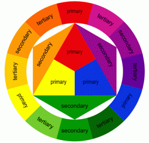
Primary, Secondary and Tirtiary Colours: The three basic, primary colours are yellow, red, and blue. If you mix all three primary colours in equal parts, you’ll get a neutral colour, usually a murky grey. When you mix any two primary colours, you get a secondary colour (green, purple or orange). Mixing a secondary colour with a primary colour yields a tertiary colour.
Complimentary and Split Complementaries: Complementary colours sit opposite each other on the 3-primary colourwheel. When mixed 1:1, they “complement” each other to a quasi-neutral grey. For a split-complementary colour scheme, you use a colour together with the two colours to the right and left of its complementary on the colour wheel.
Colour Schemes
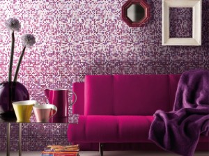
Monochromatic: In interior design, ‘monochromatic’ refers to decorating colour schemes that focus on one colour, e.g. green, but include several hues of that colour, e.g. lime, olive, turquoise, pine.

Monochromatic Purple
Analogous: Analogous (related) colours are adjacent to each other on the colour wheel. They usually combine to harmonious colour schemes eg:
- blue & green (‘seaside’ colours)
- red-orange, red/pink, fuchsia
- lime, lemon, orange (‘citrus’ colour scheme)
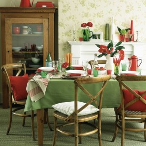
Triadic: A triadic colour scheme combines three equidistant colours on the colour wheel chart. Since all three hues come from different colour groups, this can look quite garish when highly saturate colours are used. The best way to handle triadic colour schemes is to:
- use less saturate colours
- let onecolour dominate.

Triadic Colour Scheme
Take-Home Thoughts
There’s no such thing as a ‘correct’ colour scheme! A colour wheel chart is just a visual for colour mixing, not a model of how they should be combined. Moreover, some ‘real-life’ colours like brown are absent in the colour wheel so let it not restrain you, instead, use it to explore.
Posted by Pambo Maridadi @ Crown Paints Kenya Ltd Email: info@crownpaints.co.ke


for the advancement of technology our company will grow up to 95% ,we will meet customers all over the continent .
a nice one.Kip it up.